
Humanitarian Aid - How I Made The Cover

Because a couple of you asked about how I made the cover, I'll share my secrets.
First, I don't have Photoshop. My son does, but he's at college. And I'm too cheap to buy it for something like this unless I decide to start doing all my own covers, which is still unlikely (and wait till you see Judy Bullard's cover for the next Derek Stillwater novella - love it!).
So, first. I bought a photograph from a stock photography place. I used iStock, but there are plenty of them out there. Google "stock photos" or "royalty free art" and you'll get a bunch. My search words, in this case were "spaceships" and "outer space" and "planets" although I tried "space battles" as well. When I finally found the one I liked, I paid $19 to download it to my computer. I went with the "large" format, which seemed to work. People who know more about graphic design would know more details about pixels, etc.
I'm a Mac user, so I have iWork, but I imagine you can do the same thing on Microsoft Word (which I have, too).
Anyway, in Pages, which is Apple's iWork version of Word, I pulled up a blank page. Then, under the File menu I went to Page Setup ...> Paper Size.
In the dropdown menu I clicked on "Manage Custom Sizes." I set it for wide 6 inches and height 9 inches and then named it "Book Cover Ratio." I left all the other fields alone.
Then I dragged my stock photo into the open document and resized it by clicking on it and dragging the pic's corners to where they needed to be. Then I went to the Arrange menu and clicked on "Lock" to lock the artwork down.
Then, I used Insert and chose Text. This gave me a Text box, which I positioned at the top. I screwed around with this for a while, because what I had in this case was a white box with black print, which looked like crap. Eventually I got it so the box was black and the text was white for the title. I messed around with centering it and looked at 20 different fonts (I believe this one is Impact) until I liked the one I got.
I used another text box for the print at the bottom, messed around with using a box for each one, but found it was easier with just one, sized it, got the font I wanted, and saved it.
Pages doesn't allow you to save as a .JPG, but you can safe it as a PDF, which I did. Then I opened the .PDF in Adobe Acrobat and saved it as an image in a .JPG format, and voila, I had my cover art. Took $19 and maybe an hour or hour and a half. (I'm told you can also use iPhoto for this, but I didn't figure out how to do it).
If you don' t have Pages, I imagine you could do something very similar with Word (which I do have, and which I use far more than Pages, actually).
This is quick and dirty and I didn't do any image layering, which may be more complicated, but for a straightforward image with some text, then saving it eventually to a .JPG, this was pretty easy.
posted by Mark Terry at 10:44 AM
![]()
![]()

3 Comments:
Okay, read it, liked it.
It's a bit short -- not quite 9 miles on exercise bike in basement -- but I guess that's why it's called a "short story." I tend to be much more of a novel reader than a short story reader; I subscribe to Analog and I keep telling myself I should start reading F&SF, etc. again, but I'm really much happier with novels.
I like the color version of the cover as you showed it on your site and as it shows on Amazon; the b&w version was just too dark on my Kindle. It took me a bit to get into the story (the editor portion of my brain kept wanting to change some of your sentences around) but by the time your characters were loading their gear on the hoover craft, I was totally into the story, "seeing" it unfold before me. I especially enjoyed the repartee with Corporal B'Tala. (Among the reasons I prefer novels: having been introduced to B'Tala, I thought she was a very interesting character and wanted to see more of her. It was in his interactions with her than Dr. Torres became real for me.)
Since you do explain T. Ray Drew's secret identity, I assume that the use of a pseudonym is purely a branding thing, to separate thrillers from other genres. I don't think a pseudonym is needed. That is, "Mark Terry" is a known quality I would expect a Mark Terry book to be an interesting read. It's like Robert B. Parker. He used his name for his Spencer books and then also for his Sunny Randall books and his Jesse Stone books -- and even for his westerns. But... you're the professional writer here. (Except for a couple of short stories from back in my college days, my published writing is all anonymous work-for-hire technical training stuff.)
Anyway, I enjoyed it... but must admit that I wish it would be the seed for a full novel.
Actually, I'm about halfway or more through a novel featuring Con Torres.
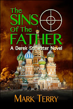
Great cover! I love the picture. I'm reading it now.
I made my cover too, but it doesn't look half as good as yours.
Post a Comment
<< Home